
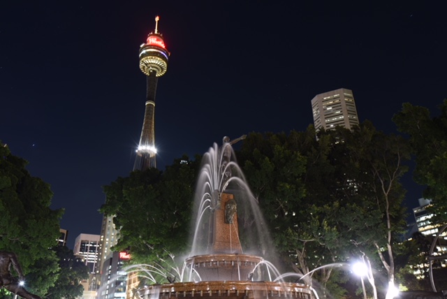
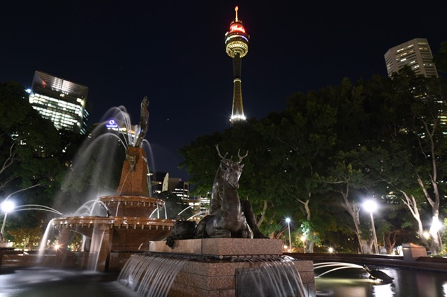
These two were photographed at Hyde Park in Sydney. I went to this particular spot in the park 3 times in 2 weeks because I struggled with determining the composition, which I had not even thought about it. I just had a rough image in my head as to what I would capture, so I stopped by the spot one clear evening after work. I had my camera but I did not have tripod.
Once I checked the all photos I took at home, I found that they were all under satisfactory quality, most of which were caught unstable or inconsiderate angles.
So, I returned to the spot in my earliest possible evening to do, which was a week after from my first shooting. This time I did not forget my tripod to bring with, and I took number of photos with no worry about image stability.
I loaded all the photos I took at home and checked them, then, I realized that every single shot missed something. For example, one did not have enough background (sky) as space so Sydney Tower looked stuck and tight on the top, while, another one chopped off the fountain hence total balance was lost in the image, etc, etc….
I was urged to be back next day, but it was raining and further to the next day I had another plan to do, so I had to wait until another free evening to have clear sky back on.
Well, third time, I had my camera (ticked), I had my tripod (ticked), and I also carried another spare lens at the spot. Actually the spare one ended up to make me satisfied for taking the scene.
Voila, these were the best two of the spot after I visited three times (or I’d say, so far?). 🙂
There is one more question leaves me, that is which shot looks better? For this one, I would like to have a help of you. 🙂
Well, I can hear you saying ‘It depends on what did you intended to capture’.
Of course that is.
But, I am still curious about your reaction / response in terms of which image you like it (or to say, comfort you), because these two should give you a little different impression though they shot at only 2 meters distance each other, so…
Your feedback is appreciated. 🙂
Thank you for stopping by.
